3 Steps to SEO-Friendly Blog Design
Your blog’s design is the bright exterior of a well-oiled strategic machine. The goal with weekly SEO content is to get people to your website — the goal of blog design is to keep them there. That’s because beautiful, user-friendly blog design makes combing through informative content desirable.
Think of the old days of the internet. Blogs looked just slightly sleeker than a Craigslist post does today. Even now, there are plenty of blogs using the same plain and creaky infrastructure. When you stumble across one of those in the wild, do you want to stay there for minutes, even hours, gleaning all you can from the content? We didn’t think so.
Beauty is only skin deep in the real world, but in the fast-paced and short attention-span metropolis that is the internet, the best words in the world still need to look good to get noticed. We believe in a very simple approach to blog design that’ll hook your readers and turn them into customers.
For this process, you’ll want to follow three core design tips:
- Prioritize user experience.
- Focus on functional blog design.
- Integrate SEO strategies.
Step 1: Prioritize User Experience
A well-designed blog provides an experience that’s easy on the eyes and consistent with the content. To get the best out of that combination, you need to put as high a premium as possible on user experience (UX).
UX is a quest to simplify, simplify, simplify. According to Eagle, this helps pages load faster and keeps users scrolling longer. It’s not to say minimalist design is always essential, but it’s a good idea to pare back whatever you can so your blog can pack a punch.
Accessing your content shouldn’t feel like jumping through hoops. If your blog looks like a carnival ride of widgets, pop-ups, and intrusive ads, you can’t blame users for wanting to get off of it. The best blog design is clean and easy to understand for users.
Consider Your Overall Brand
Every single blog page should seem like a natural extension of your brand’s identity. Before you start blasting out content, take a breather. Ask yourself what makes your brand unique. Now think about what that would look like as a website.
After you get there, there’s just one more step: building fast-loading and aesthetically appealing streams of blog content your users will recognize as uniquely yours. Make sure the color scheme, fonts, and overall appearance remain cohesive between all pages.
Experiment With Templates
Whether you’re a beginner or a long-time business blogger, there’s no need to reinvent the wheel. While originality is the end goal, you can get most of the way up the hill by using templates.
Look through what blogging platforms have to offer. For example, there are thousands of WordPress themes you can customize. See if they match up with how you want your site to look. Let them inspire you to try new design ideas. Ask yourself what tweaks you can make to these blog design examples to make them yours and yours alone.
Find the Font That Works for You
Use typography that’s consistent with your overall branding. When it comes to sizing, aim for something between 11 to 15 px for body copy. Boost the size for all your headings too. If possible, you can bring your body and header copy in line with the font you use for your branding in general. If it looks off, opting for a typical serif or sans-serif font (e.g., Arial) could work too.
Space Out Your Content
If you squish all your blog content together, your readers will jump to another site fast. Endless paragraphs and run-on sentences will make your blog design look like a homework assignment.
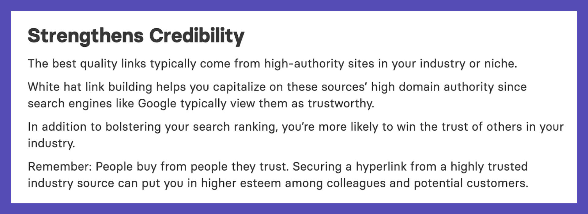
By spacing out your formatting, you make the content easy to read. Give your content room to breathe, and your readers will rest easy too. Check out this paragraph from one of our articles. The sentences are short, and so are the paragraphs. Aim for something similar.
Make room for white space between paragraphs and individual lines alike. Provide plenty of padding between each element on the screen at any given time. Still, aim for moderation. You don’t want too much white space either.
Use Thumbnails
For your blog homepage, use custom-made thumbnails or animations to link to each post. Check out the page design for our own blog as an example. Visual elements like these keep readers interested, intrigued, and eager to click on related content.
Remember you can optimize all these featured images for search engines too. Use alt text consistent with your overall search engine optimization (SEO) strategy for any given page. By combining this approach with our Wiki Strategy, you can drive over 100K users to your blog.
Step 2: Focus on Functional Blog Design
Even as you wow readers with a gorgeous user experience, it’s still essential to ensure their time on your site makes intuitive sense. Your blog should be easy to navigate and serve up a steady stream of interesting content.
Give your customers something vibrant enough to make them ogle and simple enough to scroll through with ease. The nicest car in the world isn’t much use if the driver can’t even find the ignition or gearshift. You should never sacrifice functionality at the altar of aesthetic appeal. And, luckily, you don’t have to!
Give Users the Ability to Share
Make social sharing buttons prominent on all of your blog post pages. When customers share your posts on their own social media accounts, they can provide you with free brand advertising. Make it as easy as possible for them to do so.
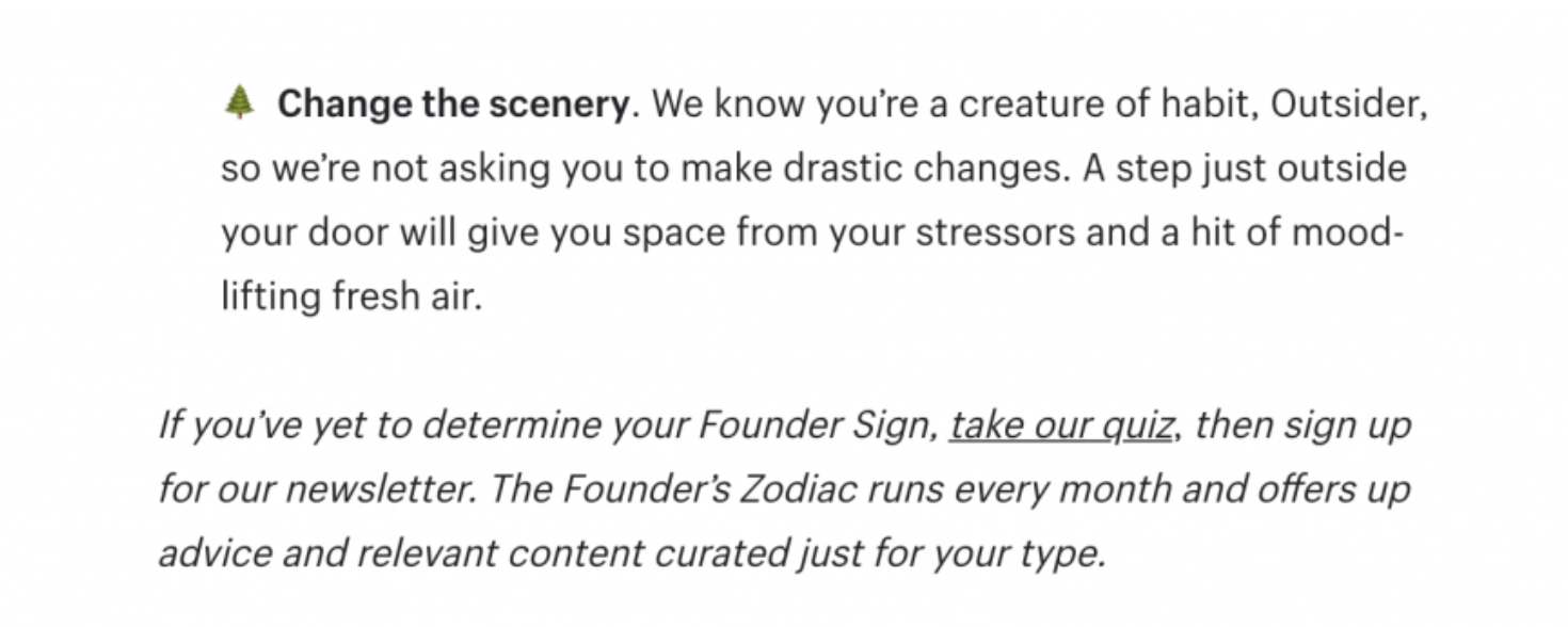
Alongside using these buttons, include a call to action (CTA) at the bottom of each article too. Direct them to additional articles to boost traffic overall too. Nudge them to sign up for your email newsletter. Encourage them to share articles they find useful.
You can include the CTA in your body text or make it stand out more in your blog layout.
As an example, notice how this Shopify post includes an emoji and italicized text to specify the CTA is coming.
Keep Multiple Devices in Mind
You never know whether your customers will see your content on their laptop, smartphone, or tablet. It’s essential you use responsive website design for your blog to accommodate each type of device.
Responsive design allows your blog to change appearance based on the parameters of any given screen. If you’re using a template to build your site, you’re in luck. Most reputable DIY site builders—think WordPress, Webflow, Shopify, and Squarespace—will do all the legwork for you when it comes to responsive design. Just make sure your content looks appealing in each view.
Make Navigation Simple
Your customers shouldn’t need a tutorial to navigate your website. They’ll expect to navigate your blog just like any other site they use.
Include an option to sift through the main types of content available at the top of the page. Alongside this navigation menu, a sidebar packed with related posts can also prove useful for a laptop or desktop view. For example, Growth Machine uses both a top navigation bar and a clickable sidebar.

Show Users Related or Recent Content
Each blog post should point your customers to related, high-performing content. Whether you run a B2B, B2C, or lifestyle blog, the goal is to generate enough content that your users have all the information they could ask for.
Display this sort of content in a sidebar or at the bottom of each article. Feel free to link out to other relevant content beyond blog posts as well. For instance, if you have a podcast, point users to relevant episodes.
Make sure you don’t sacrifice the overall design just to cram in as much related content as possible though. A few articles should do the trick. Use internal linking to nudge users to check out more content.
Step 3: Integrate SEO Strategies
Believe it or not, blog design can actually help you improve your SEO. If you’re still unsure about whether or not your blog has SEO potential in the first place, we can help with that too!
Here’s how you can integrate the nuts and bolts of SEO without sacrificing one iota of aesthetic appeal.
Design With Efficiency in Mind
Your blog layout doesn’t have to be minimalist, but it should always be as devoid of clutter as possible. Cut anything you feel isn’t essential to the content or web design. This helps the page load faster and also keeps readers engaged.
If you load up your page with pop-ups, ads, and too much information in general, it’ll drag down your SEO ranking too. When you reduce everything to the bare essentials — without sacrificing aesthetic quality — you’ll have a better chance of climbing to the first page of a Google search.
Optimize Images Too
Optimizing images for your blog means choosing high-quality photos consistent with your blog layout. But did you know you can also optimize images for search?
Name each image in accordance with your keywords for any given page. Add in alt text to ensure there’s an even better chance to gain SEO traction. Not to mention, alt text is a must for accessibility too.
A picture is worth a thousand words in real life — and it can be worth quite a few for SEO too.
Use Headings to Break Up Content
Avoid walls of text at all costs in your blog posts. Break up your blog design with headers, sub-headers, and lists. Include plenty of photos beyond the header image for good measure too.
When you create these headings, make sure to keep your SEO keywords in mind. The more you can include in these section dividers, the better off you’ll be when it comes to ranking for search.
Pair Your Beautiful Blog Design With Our SEO Impact
Your blog layout and design is what hooks readers to stay on your page. The case studies and other in-depth content are what show them you can provide value. But in order for them to see your content, they need to know about your blog in the first place.
Contact us if you’re ready to pair great blog design with powerful search engine optimization. We can help you create the sort of content to keep customers clicking and converting.

