5 Web Design Best Practices for Better User Experience
Whether you’re an enterprise or a small business, you need a good website to reel in potential customers. It might sound simple, but designing web pages that please human users and search engines isn’t always a walk in the park. You need to make your website visually appealing, functional, and optimized for search.
That’s a lot to juggle, which is why so many businesses follow website design best practices. These best practices give you a template to work from so you can simplify the normally complex process of website design.
Check out this guide to learn why web design is so important, as well as five proven website design best practices to revamp your website.
Why Does Web Design Matter?
Your website should change as your market, business, or target audience change. Instead of designing a website based on design trends or your gut, you need to follow proven website design best practices that turn heads — for the right reasons.
Done well, web design can help businesses:
- Improve accessibility: Over 61 million U.S. adults have disabilities. Nearly 5% of U.S. adults are blind or have serious difficulty seeing. Following proper website design best practices can help you give these users equal access to your website content. That’s not only the right (and legal) thing to do, but it could also boost website traffic. It’s a win-win.
- Enhance the user experience: Whether you have an e-commerce website or run a company blog, web design can help you increase the amount of time people spend on-site. The better their experience, the better your conversions will be.
- Rank better in search engines: Search engine optimization (SEO) gives businesses the ultimate edge in organic search. But did you know that search engine crawlers care about the user experience? By making your website easier to navigate, you could improve your ranking in the search engine results pages (SERPs) over time.
- Protect their brand identity: Web design is equal parts technique and design. If you want to promote your business as a quality brand in your space, website design best practices can help your website stand out.
5 Website Design Best Practices for Your Company Website
Trends come and go in web design, but best practices never go out of style. Whether you’re building a new website from scratch or you just want to refresh an existing site, follow these five best practices to get more results.
1. Create a Responsive Website
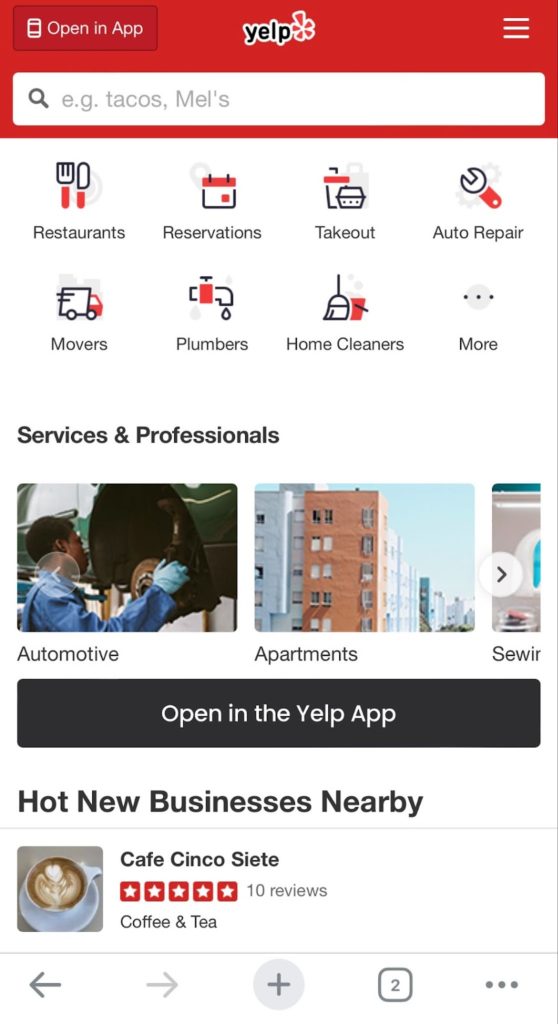
Does your website use responsive design? A responsive website adapts to different screen sizes, which gives website visitors the same experience on desktops, tablets, and mobile devices.
Most website templates use responsive design already, but it’s still good to check if yours is responsive. Even if you use responsive design, you might find that certain elements, like images or videos, don’t shrink or enlarge to the correct size. You might need to work with a web designer or developer to create a responsive site that creates a seamless user experience.
2. Include the Right Design Elements
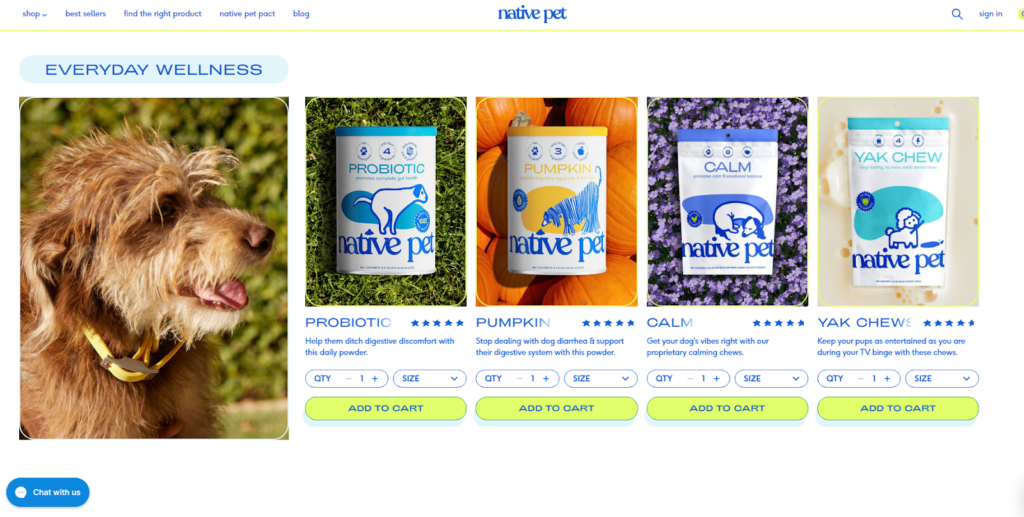
Your website’s design and layout need to make a good first impression. But when it comes to web design, less is more. Businesses need to work with a web designer to balance simplicity with usefulness and function.
Keep your website design clean and simple to avoid overwhelming your visitors. Just make sure it includes these design elements:
- Visual hierarchy: Arrange all visual elements on a web page in order of importance. This might mean adding a navigation menu in the top left corner or dropping a header image above the fold. Work with your team through the design process to ensure the most important information is near the top, so users don’t have to scroll to see it.
- Social media links: Don’t forget to link to your social media profiles. Add buttons to your website footer linking out to your Twitter, Facebook, LinkedIn, or Instagram to engage with website visitors after they leave your site.
- White space: Negative space is a must-have for any website. This website design best practice will make your site look clean and clutter-free.
- Consistent branding: It needs to be obvious that users are visiting your company’s website. Ensure that you use consistent branding, which includes your logo, color scheme, and fonts, on every page.
- Clever typography: Use on-brand typography across your website, but don’t let your design get in the way of readability. Most websites opt for sans serif fonts that are easy to read, like Arial or Helvetica. Save the fancy, less-readable fonts for headers, logos, or callouts.
3. Test Your Website Functionality

While website design largely focuses on the front end of a website, we can’t overlook how important it is to have a solid technical foundation for your site, too. After all, a pretty site isn’t much good if it’s slow or unusable.
Functionality and usability are crucial components of website design. Ensure that your website loads quickly, has a clear navigation menu, and is easy to use on both desktop and mobile devices. Make sure your search bar is easy to find, and your call-to-action (CTA) buttons are clear and concise.
If you want to go the extra mile, work with a web developer to:
- Optimize your code: Clean up your HTML, CSS, and JavaScript to improve your website load time. Use minification tools to compress your code and eliminate any unnecessary characters, comments, or spaces.
- Simplify your main navigation: Make sure your navigation bar is easy to use and doesn’t have too many options. Try to limit it to no more than seven items.
- Check your homepage: Your homepage is the first thing people see when they land on your website. Make sure it’s easy to navigate, and that there aren’t any broken links or images.
- Use breadcrumbs: Breadcrumbs are a navigational aid that helps users understand where they are on your website. They’re particularly useful for large websites with lots of pages.
4. Optimize for SEO and Accessibility
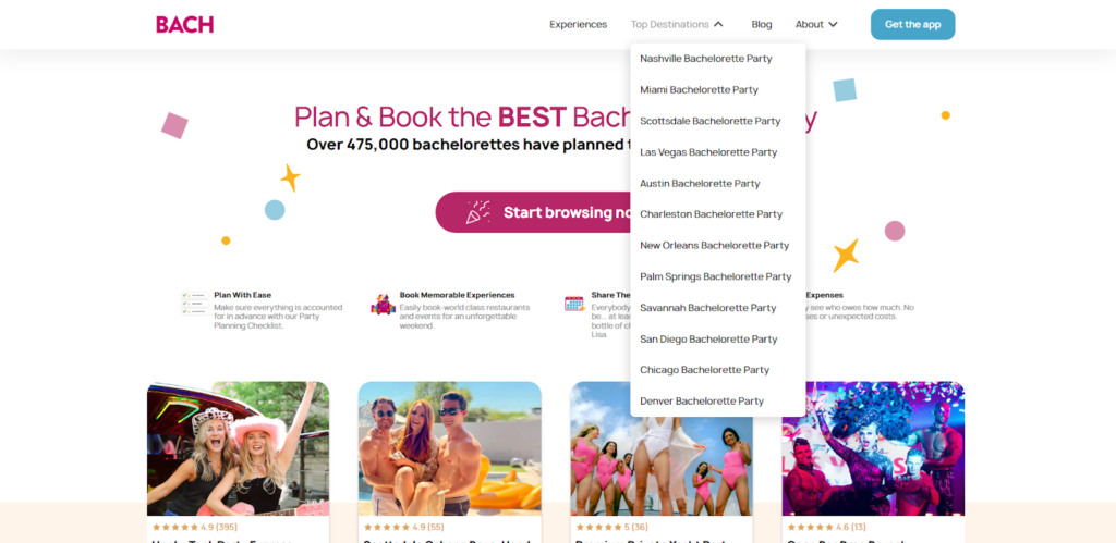
While there are plenty of ways to drive traffic to your website, SEO optimization is the best, low-cost way to generate traffic.
Through the power of optimized headings, high-quality copy, and consistent posting, content marketing agencies like Growth Machine make it possible for businesses to boost traffic with less effort.
By the way, SEO and accessibility work hand-in-hand. Search engine crawlers use the same back-end data as users with disabilities, so optimizing your site for screen readers can help you rank better in search engines, too. This isn’t an exhaustive list, but you can make your site more accessible by:
- Structuring content with H2 headers
- Following proper website architecture rules
- Including relevant alt text on all images
- Providing captions or transcriptions for video or audio content
5. Do A/B Testing
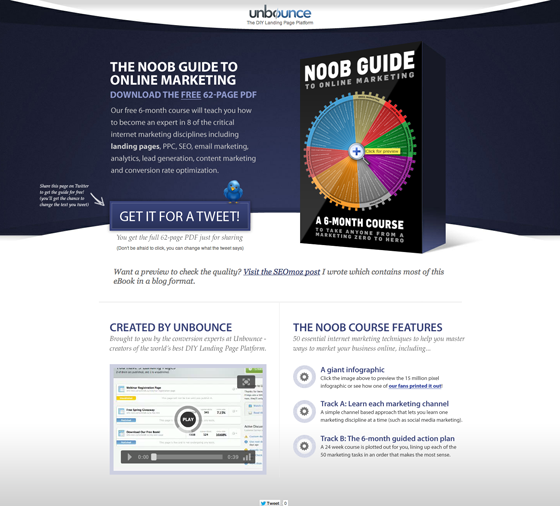
A/B testing, which is also called split testing, compares two versions of the same web page to see which option performs better. If you want to boost website conversion rates, regular A/B testing is a must.
The key is to change just one variable at a time, so you know what works. For example, you can take your existing landing pages and see whether a call to action (CTA) button performs better when it’s green or red.
This website design best practice is better suited for existing websites that need to boost performance. With regular testing, you can see which of your existing web pages are effective, which should inform your other aspects of your web design.
Unlock Your Website’s Potential With Proven Web Design Best Practices
There’s no such thing as a perfect website. Your customers’ preferences will change, so it’s a good idea to keep updating your website to give your audience exactly what they want.
Website design best practices can improve your website’s user experience, but don’t stop there. Regularly create high-quality content that gives your site visitors something to talk about.
When it’s time to fill that website with SEO-focused blog posts, reach out to Growth Machine to create and execute a content marketing strategy that can help you win more customers.


